How to Use Popcorn to Teach Rates
by Christy McGuire, Contributor
This time of year, students’ minds are starting to drift to the upcoming Thanksgiving Holidays. Why not use popcorn to channel a little of that excitement into your classroom? Use popcorn to teach graphing, rate, and slope. Let your students eat your props, and you will quickly be one of the coolest teachers to ever discuss rates.Here is how to use popcorn to teach rates.
The Slow Approach
Materials:
- Popcorn
- Paper towel
- Small plastic bag
- Cups of Potting Soil
- Ruler
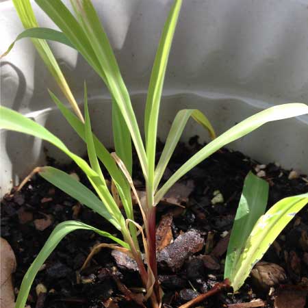
Last week I gave some ideas for teaching younger students about seeds using popcorn. Corn germinates quickly and grows quickly too, which makes it a great plant to measure over a period of time. You can get a meaningful graph by measuring every day or so.
- Start having students set up corn to germinate in the window. You can expect germination to take about three days.
- Then plant it in a pot with soil.
- Have your students measure the height of the plants every day or every two days between now and Thanksgiving, and record your findings on a labeled data chart.
- On the last class before Thanksgiving break, you can have them graph their findings. You may want to remind them that time is the independent variable, and thus belongs on the x (across the page) axis. Height is the dependent variable and thus belongs on the y (vertical) axis.
The Fast Approach
Materials:
- Popcorn
- Stop watch
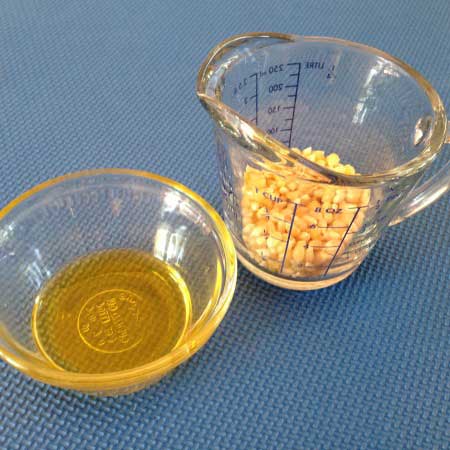
- Oil
- Cooking Pot
- Heat Source
(You can also use a bag of popcorn and a microwave)
Have your students get set with lined paper and their pencils. Tell them that during each twenty-second interval, they are to make a mark for each pop that they hear.
When you call time, move to the next line and make a mark for each pop. They will repeat until all the corn is popped.
- Put a couple tablespoons of oil in the cooking pot and about a quarter cup of popcorn. Cook on medium heat with the lid covering the pot.
- When you are finished, pop some more corn, and let your students enjoy while they make their data charts and graphs. Time is again the independent variable and belongs on the x (horizontal) axis.
- If there is interest, try repeating for differing amounts of popcorn and think about how the amounts affect your data.
Analyzing the Data for Either Approach (or Both!)
Depending on where you are in your curriculum, there are a few different directions you can take your class after completing their graphs.
If you do both of these projects, ask students to write a paragraph comparing and contrasting the graphs.
Or, You can have your students draw tangent lines near the beginning and end of the curve. Tell them to find the slope of each and write an explanation of why the slopes are different.
Or, ask your students to add best fit lines to the graph and calculate their slopes. Students can write a paragraph in which they compare and contrast the results of the best fit line to those of the tangent line and give an opinion on which is more useful.
Or, tell students to add a third tangent line in the middle, and find that slope. Then, graph the slopes verses time. Ask students to write a paragraph explain the meaning of this new slope.
Put popcorn on the shopping list and plan to have some fun in your class this week.
Christy McGuire is a trained physics teacher who loves developing new ways for students to engage with science. While taking a break from the high school classroom, Christy rediscovered that young children are tons of fun, and can learn powerful science and math too. Now she is attempting to cross the excitement of early childhood style learning with serious STEM study to benefit students on both ends of the learning process. Find activities and reflections on STEM learning on her blog: www.ThrivingSTEM.com.


Developing new ways to teach science makes it easier to learn. Thanks a lot for writing Christy.